

A dedicated space for music lovers to share their opinions.


January 2023 — March 2023, Remote
A dedicated space to help connect, foster, and maintain the broader music community.
My Roles
UX Researcher
UX + UI Designer
Product Tester
Timeline
Research — 3 weeks
Design — 3 weeks
Testing — 1 week
Tools
Figma
FaceTime
Maze
THE PROBLEM
Music lovers do not have a dedicated space where they can directly share their thoughts and opinions with the broader music community.
Community plays a large role in the music industry. Avid music listeners love to interact with one another and discuss their opinions on their favorite artists or the latest album release. The problem, however, is that there is no dedicated space for individuals to connect with each other and share these opinions. While they can discuss their opinions on social media platforms like Twitter, those platforms are highly saturated with a variety of other content which makes it hard to keep topics separated. Due to this, I began to brainstorm product ideas that would help individuals share their opinions on music while simultaneously fostering and maintaining the broader music community.
THE SOLUTION
A product where users can write and share reviews about their favorite artists and music with friends and the broader music community.

Filterable feeds.
Homepage with two distinguishable feeds with unique filters that help users to control the type of content that they see.

Personalized groups.
Create dedicated group pages to share or read reviews from select users to further narrow down the content that you see.

Customizable reviews.
Create engaging reviews with a personal touch by adding in images and then use custom tags to help categorize the reviews on your profile.
BACKGROUND RESEARCH
People are motivated to share and read reviews for a variety of reasons.
Have you ever talked to a friend about a restaurant they just neeeeed to try?
What about telling your friend about the movie you saw last weekend that was soooo much better than you expected?
Reviews are shared more often than one might think and for a variety of reasons, but what leads people to share them in the first place?
In a study conducted by Trustpilot, it was found that sharing reviews helps people to feel a sense of expression or empowerment. This could be due to reviews acting as an outlet through which people can share their personal opinions and experiences. It is also through sharing reviews that people begin to feel a sense of communal ethos which, in effect, helps them to feel as if they are helping to build and maintain a community of like-minded individuals.
In terms of reading reviews, however, there are underlying reasons as to why people do it. One of these reasons is a psychological phenomenon known as social proof. This phenomenon refers to the idea that people reference the behavior of others to guide their own which makes sense since humans are naturally curious beings. Through referencing the behavior of others, particularly their reviewing behavior, it helps people remove and decision-making uncertainty.
COMPETITIVE ANALYSIS
There are several products out there that help users to share their opinions on various types of media, but only one of them focuses on music.
In order to gain more insight into this specific industry, I researched a few currently available products with features that aim to accomplish a goal that is similar to my own:


Musicboard
During my research, I found a product titled Musicboard which would be the direct competitor to my product. With most of its features being similar to other products in the space, one feature that stood out to me was the Review Statistics which lists out an overview of a user’s review history. One thing I think is missing, however, is a way for users to categorize and organize their reviews for later reference or for friends to view.


Letterboxd
Another product in the space with similar offerings is Letterboxd which allows fans of cinema to rate and review their favorite films. While it’s offerings are similar, I noticed that the product’s home feed wasn’t as intuitive as it could be, but they did offer a feature that allows users to tag their posts. This helps users to organize their reviews into personalized categories for later reference.


Goodreads
Goodreads is the last product I researched during my competitive analysis. This product offers users a space to share their opinions on their favorite books. I also found the home screen to be not very intuitive and felt as if they offered more ways to discover books rather than actually leaving reviews. One feature that stood out to me was the Reading Challenge which helps users set and track reading goals.


TikTok
Lastly, I looked at TikTok as an indirect competitor for my project. TikTok is home to many conversations and topics of discussion. Users interact with each other and talk about personal stories, news, and entertainment. I really wanted to capture that social nature, but specifically for music conversations. I also like how TikTok’s algorithm shows content specifically tailored to you.
The first thing I noticed about each of these products (excluding TikTok) is that all seem to offer the same set of features like review feeds, new post screens, and a search functionality to discover new music, films, books, etc. For Musicboard, specifically, there seemed to be a lot of crossover from what is currently available to some of my ideas that I’ve been brainstorming like the Review Statistics. With these findings, it was time to decide on the specific problem I am looking to solve and begin my user interviews to gain insight into what solutions would benefit them the most.
THE BIG QUESTION
With my background and competitive research complete, I began brainstorming my potential research question that would guide the rest of this project.
During my research I found that individuals actually enjoy sharing and reading reviews, especially when it comes to things they are passionate about. wanted to figure out a way to encourage avid music listeners to not only feel comfortable sharing their music opinions, but also feel excited about doing so. I created the below POV statements to help me in exploring this goal further:
I’d like to explore ways to help people who enjoy listening to music to connect with the broader music community because it will help them find community with individuals who share similar interests.
I’d like to explore ways to encourage avid music listeners to share their music opinions because it will help in fostering community for like-minded individuals.
I’d like to explore ways to help avid music listeners to share their opinions on the music they listen to because it can help them to really dissect the music and formulate opinions.
I’d like to explore ways to help avid music listeners to track the music they listen to so they can get a better understanding of their listening habits.
From these POV statements, I developed some HMW questions to help guide me in forming my research question:
How might we encourage music listeners to share their personal opinions?
How might we connect individuals with other people who share a similar music taste?
How might we allow users to track the music they listened to?
How might we create a dedicated space for music reviews?
How might we make the review process more personal?
With my POV statements and HMW questions formed, I finally decided to focus my project on finding a way to help connect the broader music community and create a dedicated space for avid music listeners to interact with others who share have similar taste. I also decided on a more concrete research question that will be used to guide my design decisions throughout this project:
How might we connect individuals with other people who share a similar music taste?
USER INTERVIEWS
Participants said that reviews are more trustworthy if they include pictures and/or if they come from someone they know.
After deciding on my research question, it was time to begin conducting user interviews. I ended up interviewing 5 individuals and asked them each questions about their experience with reading and leaving reviews.
Through my research, I found that all interviewees have left reviews in the past and would leave more in the future. When it comes to reviews, however, most of the interviewees said that they trust some more than others. Some things that they said make a review more trustworthy are having a picture/video attached to it, having it come from someone they know, as well as just getting a general feel for the tone of the review.
Participants don’t actively search for music reviews, but they do exchange recommendations with friends.
Another insight I uncovered through my user interviews was that the interviewees don’t actually go and search for reviews on their favorite songs and/or albums. They do, however, share and receive music recommendations with friends. The reason they do this is because their friends will typically have a good understanding of the type of music they listen to or would potentially enjoy which is line with my previous finding that people tend to trust reviews more from people they know.
USER PERSONAS
Based on the user interviews, it was time to put a face to who I am actually creating this design solution for.


I decided to create two personas based off of my findings: The Music Reviewer and The Discoverer. These are based on the insights I uncovered about my interviewees’ experience with sharing and reading reviews. I also incorporated details that reflected the findings from my interviewees’ experiences with sharing music recommendations.
BRAINSTORMING
With my user research completed, it was time to begin brainstorming possible design solutions.

BeReal but for music
When I began brainstorming, the first idea that came to mind was an app similar to BeReal we’re users would be asked to share a song at any given point throughout the day. I decided against this idea though as it didn’t feel like a good enough way to help people share their thoughts and opinions on music or find community.

Streaming Tracker
The next idea I had was an app that organizes a person’s streaming or review history into a fun and digestible dashboard. In my user interviews, I found that people tend to enjoy features like Spotify Wrapped so I felt like this could be a fun way to have users share their personal streaming habits. I didn’t choose this idea, however, as it didn’t feel very social or interactive which is something I hoped to achieve with my product.

Review sharing platform
My last idea was a review sharing platform that would encourage users to share their opinions on their favorite artists and music. In order to differentiate my product from what’s out there I thought of including a groups feature to help people share reviews with specific users.
Following my brainstorming session, I ultimately opted for the review sharing platform with a group feature to give users the ability to share reviews with a select group of users as well as read reviews from people who know their interests.
FEATURE SET
After settling on a design solution, I listed out a variety of potential features and organized them based on three levels of priority.
Must-have: A feature that is essential to the goal of the product and a key component of the solution.
Nice-to-have: A feature that elevates the solution and wouldn’t take too much time or effort to implement.
Surprising and delightful: A feature that will help the product stand out from competitors, but would require a bigger lift.
THE PRODUCT’S FLOW
With features organized according to priority, it was time to map out some task flows that were in line with the chosen design solution.
When brainstorming different flows to design for, I tried to think about which flows in particular would be the most relevant to the solution I was designing. Ultimately, I decided on designing flows for adding a new user to a group and sharing a review with a group said group.
Task Flow #1 — Adding a user to a group
Task Flow #2 — Sharing a review
BRANDING
Before jumping into designing the screens that would directly correspond to my task flows, I wanted to decide on the UI elements that would later be incorporated.
When it came time to think about my product’s branding, I wanted to start out by brainstorming different product names. Ultimately, I decided on the name Tracks which actually has a double meaning behind it. This name represents the idea that users would be tracking their reviews and opinions on various songs and albums while also representing that the term “track” is a synonym for the word “song.” Additionally, in terms of the logo, I initially intended on using a simple wordmark, but was inspired to drag the ‘s’ to symbolize an actual track.
Next, I needed to decide on other UI elements like the color palette I would incorporate throughout the product. I really wanted the product to feel both sleek and modern, so I kept the color palette simple with shades of black and white as well as a few accent colors. By sticking to a simple color palette, I also was able to let the album artwork and other images in the product to take center stage.
In order to maintain this modern feel, I decided to go with a sans-serif font as it would help with readability and would help the large amounts of text not appear so cluttered.
LO-FI WIREFRAMES
Now that I got the key task flows identified, it was time to begin designing some low-fidelity wireframes for my product.
Feed
Group Screen
Edit Group
Album Page
New Post
INITIAL FEEDBACK
Upon feedback and additional research, I decided to create an additional flow for filtering the home feed.
Once I finished up my low-fidelity wireframes, I reached out to others for feedback on my designs. A common theme I noticed in the feedback was incorporating a way to help users to tailor the content they see through filters. Before diving into task flows and wireframes, I conducted another competitive analysis to see how other products tackle this similar issue.


TikTok
I first looked at TikTok which was one of the products I researched during my previous competitive analysis. One aspect that I found slightly confusing was that they had some filters located in the filters tab and some others in the search screen itself. It was difficult to find which filters were in which screen upon my first run-through.
Next, I looked at LinkedIn and noticed that they had a wide variety of filters. I liked that they were very comprehensive and kept them all in one screen. I also really appreciated having the ability to reset my filters if I wanted to start a new search from scratch.
With some research under my belt and clear path ahead, I created an additional task flow for this new design solution. In terms of my design solution, I decided to move forward with a similar approach to LinkedIn. I felt as if their filtering system helped to minimize user error and ensure that users could find the exact content they are looking for.
Task Flow #3 — Filtering your feed
When designing for this solution and task flow, I went through multiple iterations based on feedback from my mentor and other designers.
Version 1
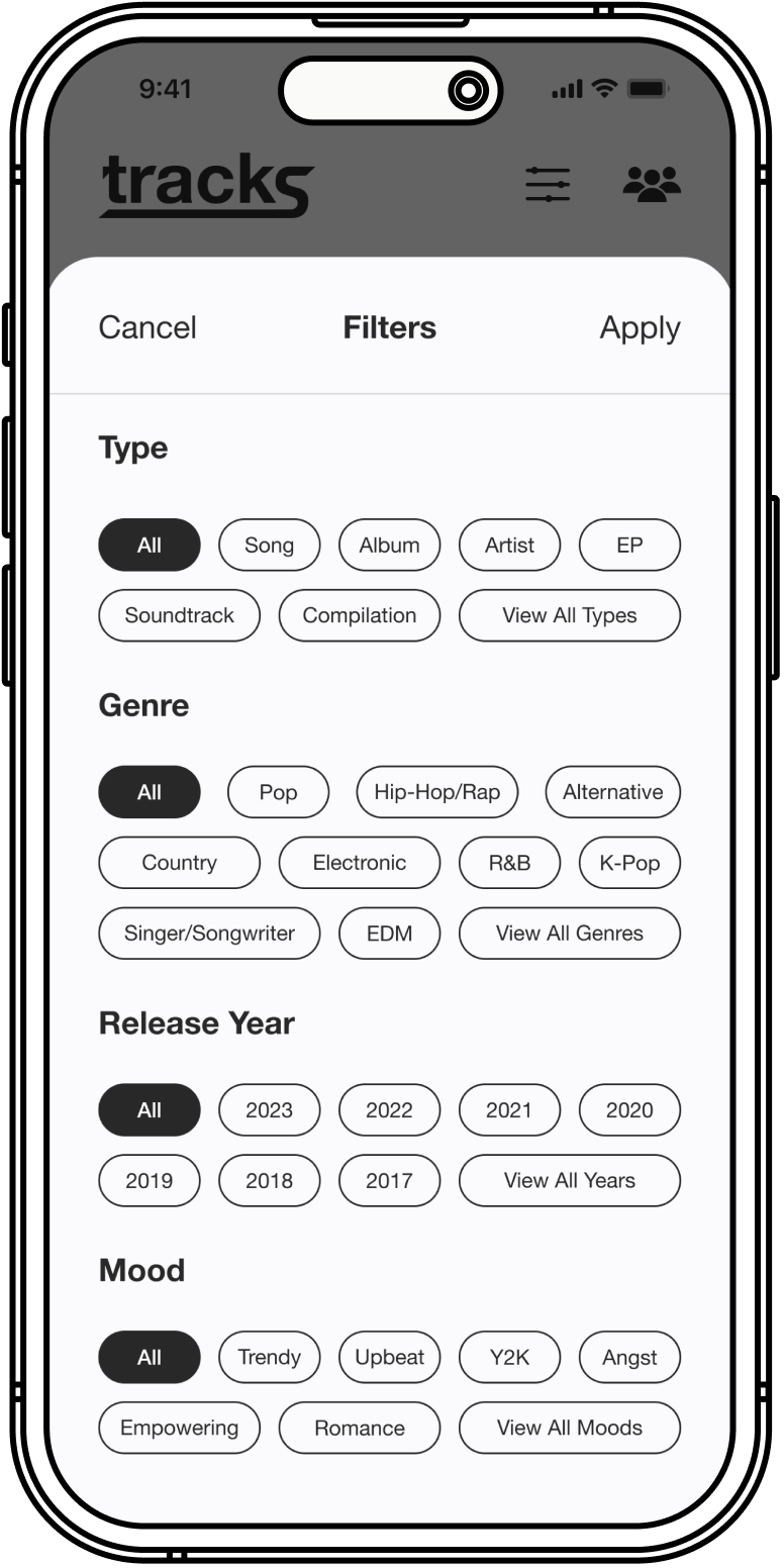
Version 2

HI-FI WIREFRAMES
After implementing the new task flow into my design, it was now time to incorporate my UI elements and create some high fidelity wireframes for user testing.
Feed
Group Screen
Edit Group
Album Page
New Post
Filter
USER TESTING
For testing, I conducted 6 unmoderated usability tests through Maze. Through these tests, I uncovered that most participants felt that the interface itself was intuitive, but some aspects of the design felt a little bit unclear to them such as the reviews in the home feed as well as the categorizations when filtering one’s feed.
While users were able to navigate through my prototype, some aspects of the design and copy were unclear to them.
Clearer Feed
Through testing, I received feedback that it was hard to distinguish individual review cards within the home feeds. In order to fix this I added 10px of spacing in between each card to ensure that each card would be able to be differentiated from one another.
Before

After

Clearer Copy
I also found that users who tested my prototype found some of the copy confusing, specifically the “mood” category when filtering the home feed. I changed the copy to say “vibe” as it encapsulates more options than the mood category did.
Before
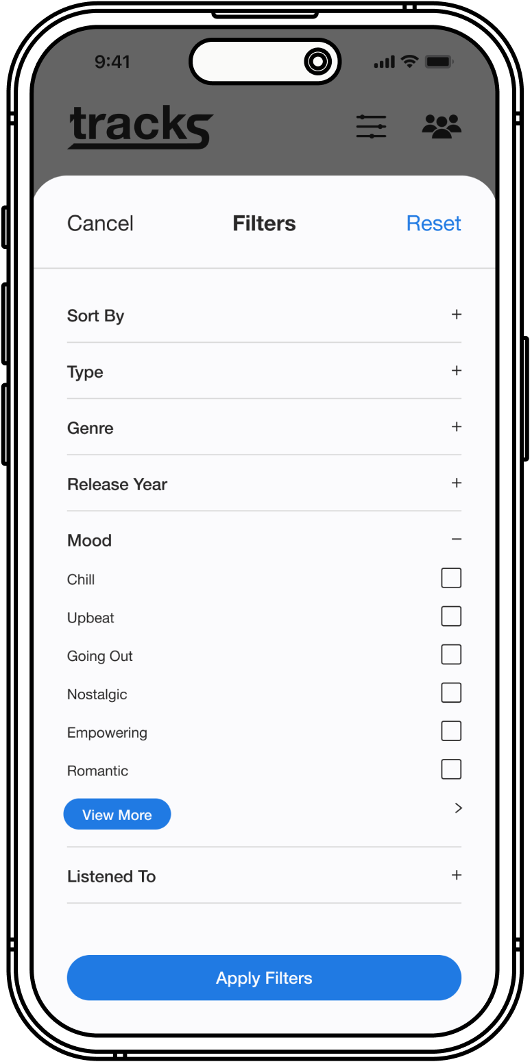
After

FINAL PROTOTYPE
Upon completing my user testing sessions and sharing my prototype in group critique sessions, I implemented all of the feedback and created my final prototype.
Once I finished up my low-fidelity wireframes, I reached out to others for feedback on my designs. A common theme I noticed in the feedback was incorporating a way to help users to tailor the content they see through filters. Before diving into task flows and wireframes, I conducted another competitive analysis to see how other products tackle this similar issue.

REFLECTION
Collaboration and user feedback are crucial elements to a great product.
Going into this project, the idea of creating an MVP for a completely new product on my own seemed pretty daunting. However, as I went through the process, I realized I wasn’t on my own. I was actually pretty far from it. I collaborated with numerous individuals during each stage of the UX design process through my weekly mentor calls, group crit sessions, user interviews, and user testing. I began to realize just how important collaboration is in this field as it helped me to step out of my little bubble and gain a more holistic view of the product I was creating and, in effect, design for the user rather than myself.
There is always room for improvement.
One of the biggest challenges I faced with this project was knowing how much to design for, how many features or screens to include, as well as when to stop tweaking my design. Being a perfectionist at heart, I struggle with leaving a project alone when I know there is a lot more that can be done to improve it or help take it to that next level. However, by placing a time constraint of 80 hours to complete this project, I was able to create a comprehensive MVP for a new product without working toward the impossible goal of a perfect product.
NEXT STEPS
Revisiting some of my old ideas that I did not explore due to time constraints.
In terms of where I would take this product in the future, I would like to explore adding in some of the features that I listed in my feature set, but did not explore further. These features would include a way to integrate Tracks with streaming products like Spotify or Apple Music. Through this integration, users will be able to create automatic playlists based on the music they share reviews of in the Tracks application. This would provide users with a more immersive way to share the music they’ve reviewed by allowing their friends to listen to all of said music in one place.
Another feature I would like to explore in the future is one where users are able to see how their reviewing statistics stack up against their friends and add a more interactive component to review sharing. My inspiration for this feature would be similar to Apple’s Fitness application where users are able to set up different goals and compare their progress to that of their friends.
Lastly, I would like to include a few more screens to my current flows to flesh out some more of the current flows. These screens would include adding comments to reviews, viewing users’ profiles, as well as exploring the Mixes option as shown on the group screen.